Seven Years in and I finally have branding
The Tortuous Process Behind Designing Your Own Branding
Branding yourself is hard—especially being IN the creative industry. With clients, the expectations are clear, my designs are proficient, effective, and precise. I deliver on challenging assignments, move swiftly through complex briefs, and love seeing a client’s face light up when their vision takes shape in my designs.
But the moment I would try and become my own client, it was a different story . My confidence was replaced by relentless self-critique. I’d get stuck on minor details before figuring out the bigger picture, flip-flop between decisions, and agonize over choices that should have been simple.
Convincing myself that something is “good enough” has always been a challenge, perhaps because of everyone’s favourite buzzword and my Japanese inclination toward kaizen: the belief that everything can always be improved and refined. That struggle becomes even more intense when you’re designing something meant to represent yourself, removing every safety net. There’s no client to lean on for unclear briefs, only yourself to hold accountable if the result falls short, and no undo button once it’s released into the world. And then I realized I had been avoiding this work for nearly seven years.
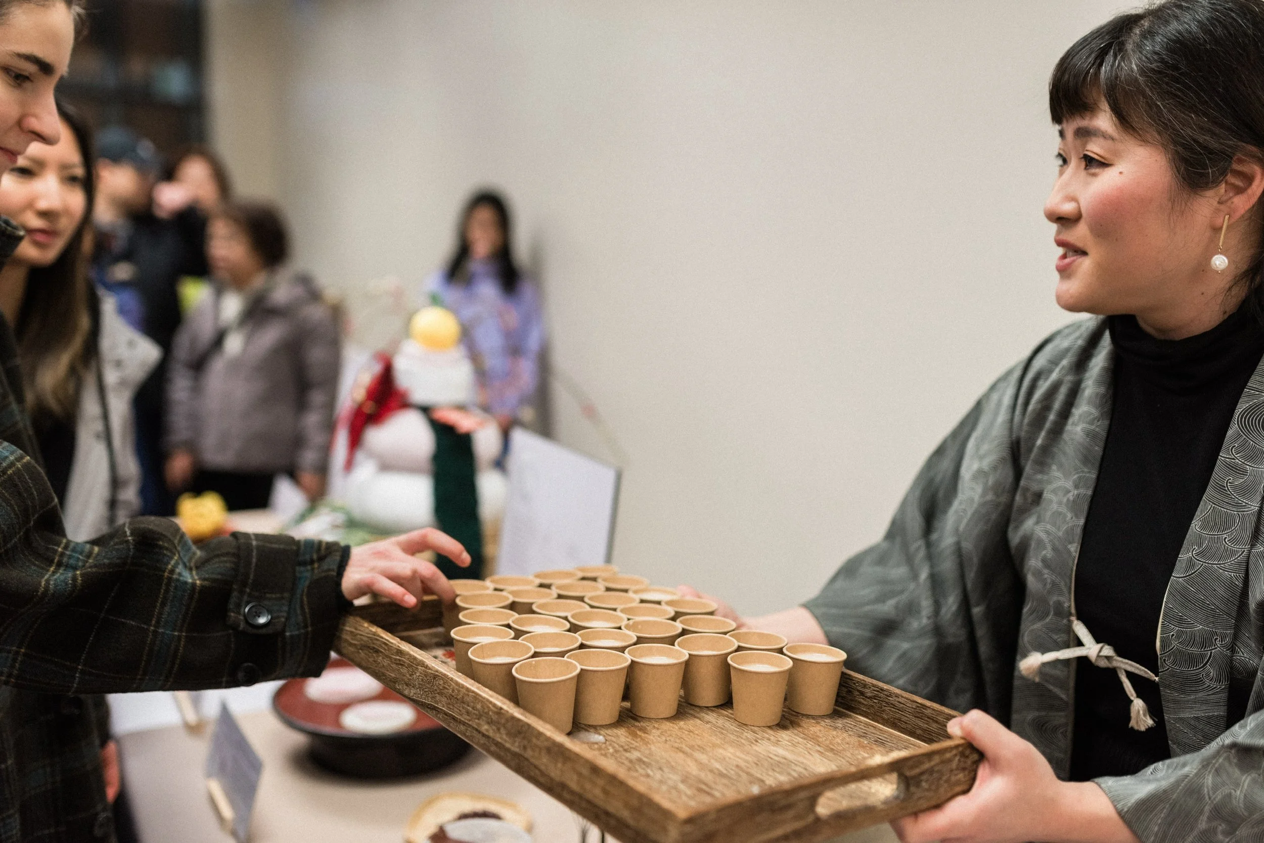
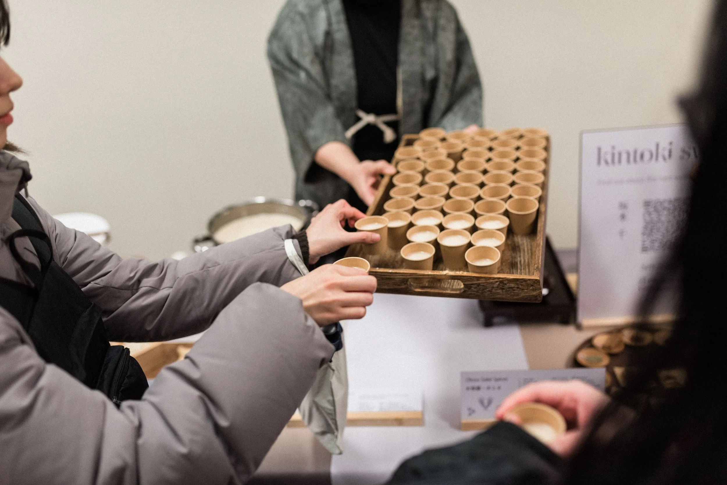
Then, suddenly, I had just twenty days to finalize kintoki sweet’s identity. I received a email and had been invited to exhibit my work at a Japanese New Years Event. I had no branding, no identity, no clear direction or messaging. I needed to fill two six-foot tables with a presentation of what I do, and the responsibility rested entirely on me. The timeline was tight, but finally, I had no choice: I had to sit down, focus, and bring it all together. It was a challenge that was as daunting as it was motivating, forcing me to confront the work I’d been avoiding for all those years.
To move forward, I actually had to step back and ask myself: What is kintoki sweets, really?
I do workshops, I’m not interested in catering. I don’t produce wagashi for sale. I don’t even claim to make the best wagashi. There are professionals in Japan who have practiced and perfected this craft for centuries, generational artisans producing extraordinary, delicate work. I also don’t have formal culinary training or a background in the food industry.
But there’s one thing I do exceptionally well: I ask questions and I chase the answers with the curiosity of an experienced museum exhibits designer making sure everything I present is the most accurate information. I dig deep, cross-referencing sources, testing recipes again and again, taking meticulous notes to make sure everything I present is accurate, reproducible, and not a fluke. I follow threads of history and meaning, uncover interesting hidden stories, and hunt down etymology for little hints that reveal more than meets the eye. It’s this investigative approach that allows me to talk about and teach wagashi not merely as sweets, but as carriers of culture and tradition.
The questions I tend to ask are often ones both Western and Japanese audiences overlook. Over time, I noticed that most fell into a few recurring categories:
The answer was considered common knowledge.
The question was dismissed as uninteresting or irrelevant.
The practice had “always been done that way,” and the original why had been lost.
Growing up in Canada gave me a unique perspective on my own Japanese heritage. I was close enough to understand the subtle cultural nuances, yet far enough removed to notice what might spark curiosity in someone unfamiliar with them. And being Japanese, I could sense that meaning and intention existed behind certain practices, even when they were no longer consciously acknowledged, misunderstood, or merely and simply accepted as “cultural differences.”
I love rabbit holes. My questions often led me down long, winding dives through literature, moving between Japanese and Chinese sources, comparing them with Western academic papers, teasing out enough understanding to satisfy my curiosity and finally allowing myself to sleep without spiralling into a whirlpool of questions that I needed answers to (for the moment!).
Taking the step back, I realized that my love of wagashi was never just about the sweets themselves, but about how these small, delicate confections preserve and convey Japanese culture. Asking questions that no one could answer pushed me to explore my heritage more deeply. This insight inspired the perfect catchphrase for Kintoki Sweets: “Culture through Confectionery.”
Wagashi are deeply connected to Eastern festivals, seasonal events, traditional poetry, songs, and artistic references. They can certainly be enjoyed for their beauty and flavor alone, but knowing the history and symbolism behind each piece adds a deeper layer, satisfying both appetite and intellectual and cultural curiosity.
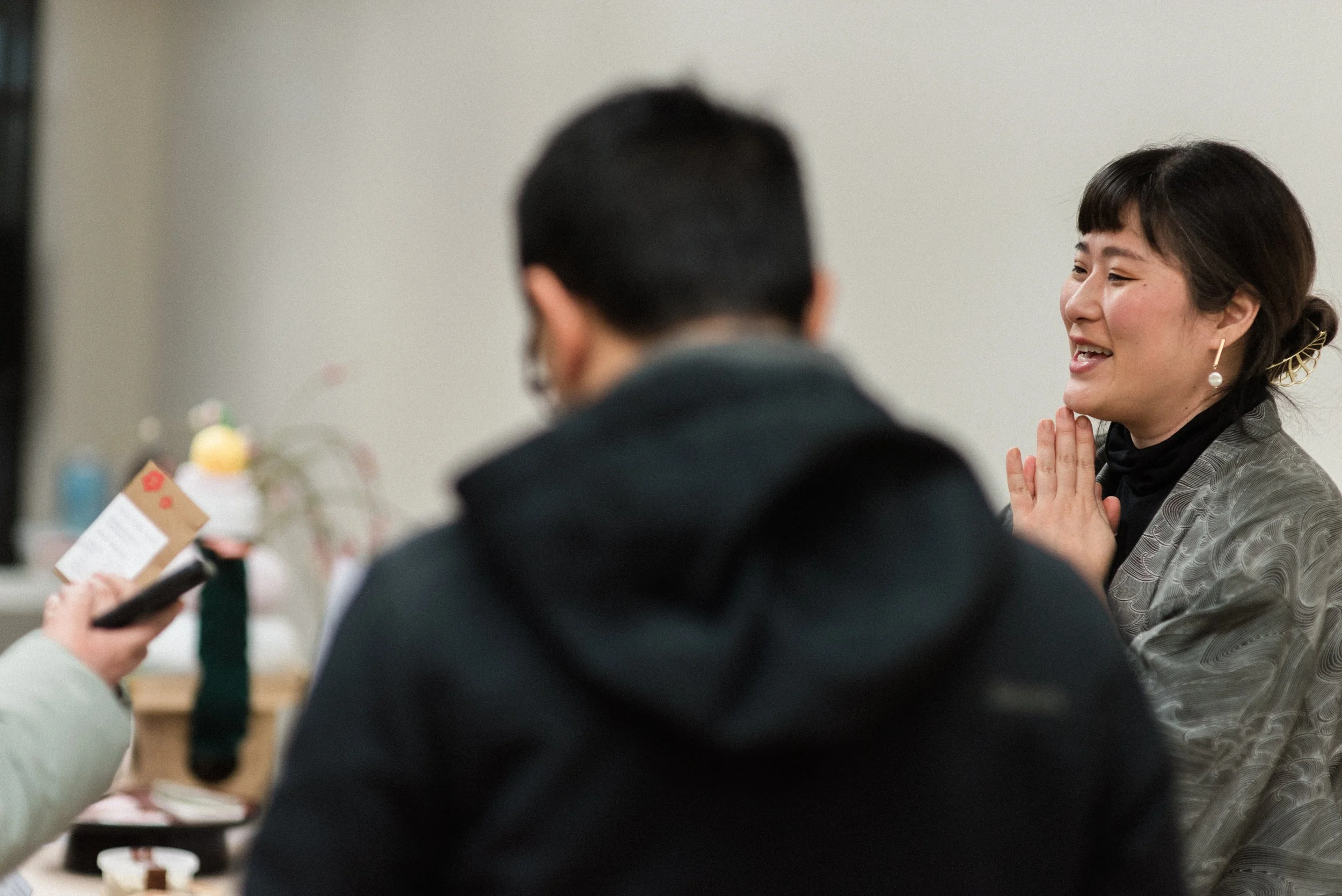
With my identity and elevator pitch defined, I understood why teaching wagashi workshops felt right, while production for sales did not. The true magic lives in the moments of revelation: when workshop participants uncover the subtle cultural stories folded into each confection. Even older Japanese attendees are often surprised, confessing that the wagashi they had known all their lives carried meanings they had never noticed, having arrived simply to learn how to recreate them at home alongside a cup of tea.
A Case for Type
Font selection can feel like a beautifully designed nightmare. Finding a typeface I genuinely liked and that fit the brand’s voice and could accommodate both Japanese and English was a very specific form of torture, reserved for the most masochistic, 3 a.m., tea-fueled sessions of delirium. Eventually, I gave up on finding a single solution and divided the search into four categories:
English title font: For “kintoki sweets,” I wanted a elegant, clean, yet visually engaging font with full glyph support for characters like é and ō.
Japanese title font: Something emotionally resonant and expressive, without slipping into clichéd “Asian restaurant” aesthetics.
English subtitle/body font: A sans-serif that was easy to read but had thoughtful design details to avoid feeling generic and sterile.
Japanese body font (Mincho/明朝): To harmonize with the English sans-serif in the body text. I avoided the sans-serif version of asian type (Gothic-tai (ゴシック体) characters,) which lacked the elegance I wanted.
Surprisingly, I found the Japanese title font first, It felt like a friendly face, slightly nostalgic, like stumbling upon an old wood‑facade wagashi shop in a Showa-era neighborhood. Scrolling through hundreds of Japanese fonts, this one immediately stood out with its warm, retro-yet-clean aesthetic.
With the main Japanese font chosen, I searched for an English serif font to match. I was drawn to the little dumpling-like “dango” ball terminals on some letters. After much searching, I discovered the perfect match. At first, it seemed too curly, but paired with the Japanese font , they complemented each other beautifully.
One glyph in the English font set that was available for the small “o” in Kintoki reminded me of a bean. This inspired me to add the silhouette of a kintoki bean inside the o, the namesake of Kintoki Sweets. (And it was a perfect icon to make into a favicon in a web browser) The ball terminals in the fonts were so dumpling-like that I turned the “i” into a skewed set of dango, also signaling that the sweets I made were traditional Japanese wagashi, not Western sweets.
For body text, I went with ones that were both elegant, readable, and welcoming, allowing text to feel refined without sacrificing clarity.
Designing the Logo
With the typography decided upon, I turned my attention to the logomark. I wanted a symbol that was simple but instantly recognizable, sweet but not saccharine, traditional yet modern. The challenge felt like a riddle posed by a Sphinx. As I reflected on the process, I remembered a conversation with Junichi Mitsubori, the world-renowned wagashi artisan, and something clicked.
I had long thought the philosophy of 花鳥風月 (kachōfūgetsu), the four elemental motifs of Japanese aesthetics: flower, bird, wind, and moon was somewhat cliché, even old-fashioned. But translating for Mitsubori-Sensei during his master classes in Toronto last November revealed its depth in his interpretation and explanation of kachōfūgetsu. The wind was not merely air in motion; it was a way to honor and appreciate the landscapes it touched. The moon was more than a celestial object; it marked the passage of time, inviting mindful attention to the rhythm of the seasons and the festivals that punctuate the year.
In that moment, I realized that kachōfūgetsu captured everything I loved about Japanese culture, the subtle attention to nature, the cadence of life, and the practice of noticing and appreciating the small, often overlooked details. I knew I wanted this philosophy reflected in my logo, so that every time I see it, I am reminded of the values and traditions that inspire everything I do.
I designed the logo drawing inspiration from traditional monshō-style circular crest emblems, dividing it into four sections to give each element its own space to breathe. The birds drew from traditional 千鳥 (Chidori) motifs; the wind took inspiration from ukiyo-e woodblock prints; a humble kintoki bean to represent the flora/flower; and all were framed by a crescent moon. The moon itself inspired the main brand colour: Geppaku (月白), a pale, clean “moon-white” grey, simple, modern, and evocative.
With the logo, color palette, and typography finally in place, I had a visual language that could carry the philosophy of kachōfūgetsu into everything I create. It was a way to honor tradition while giving it a contemporary voice, a reminder, every time I see it, of why I love this culture and the work I do
Bringing It All Together
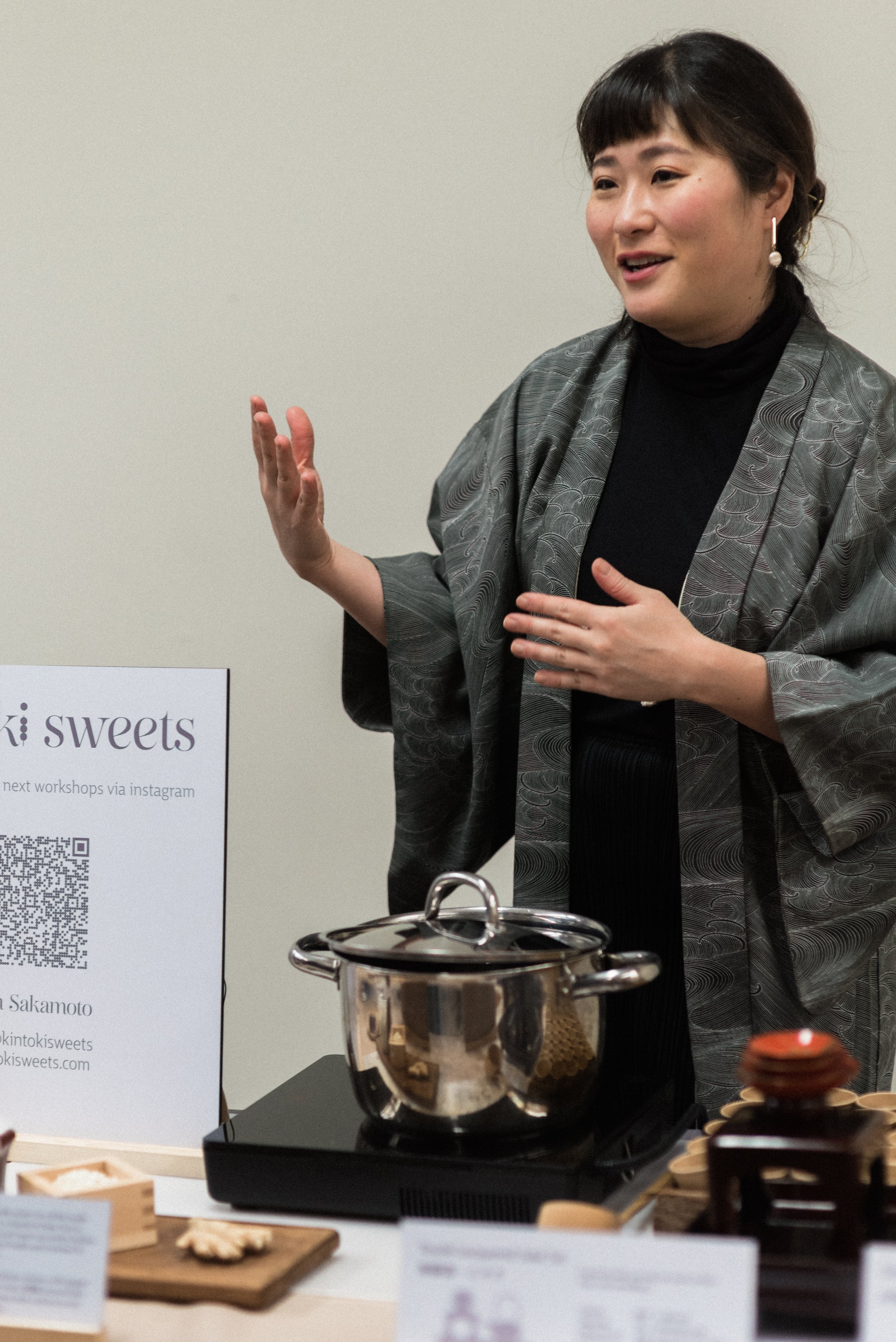
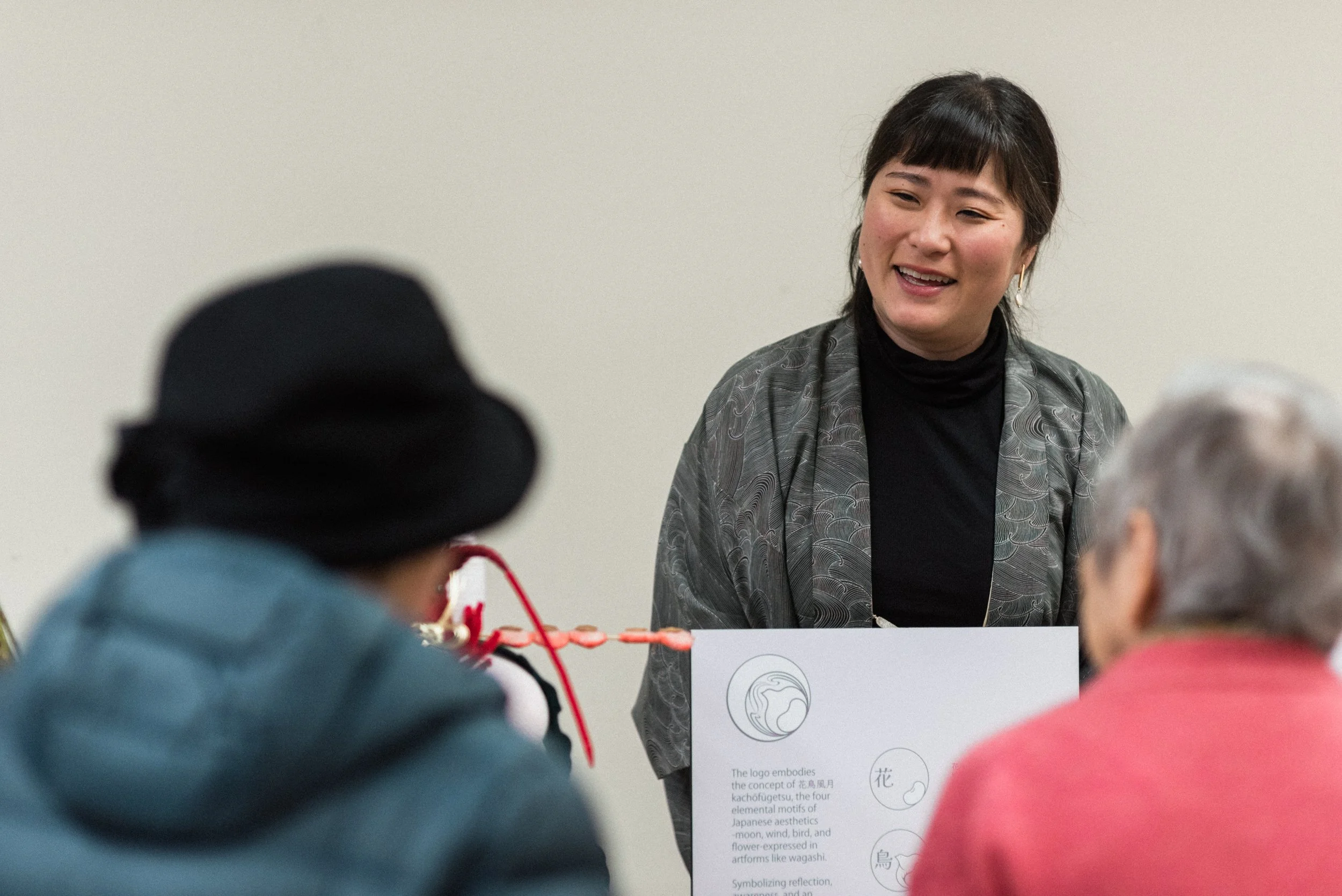
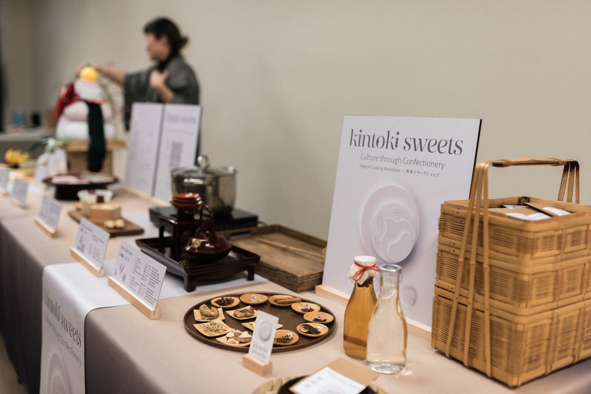
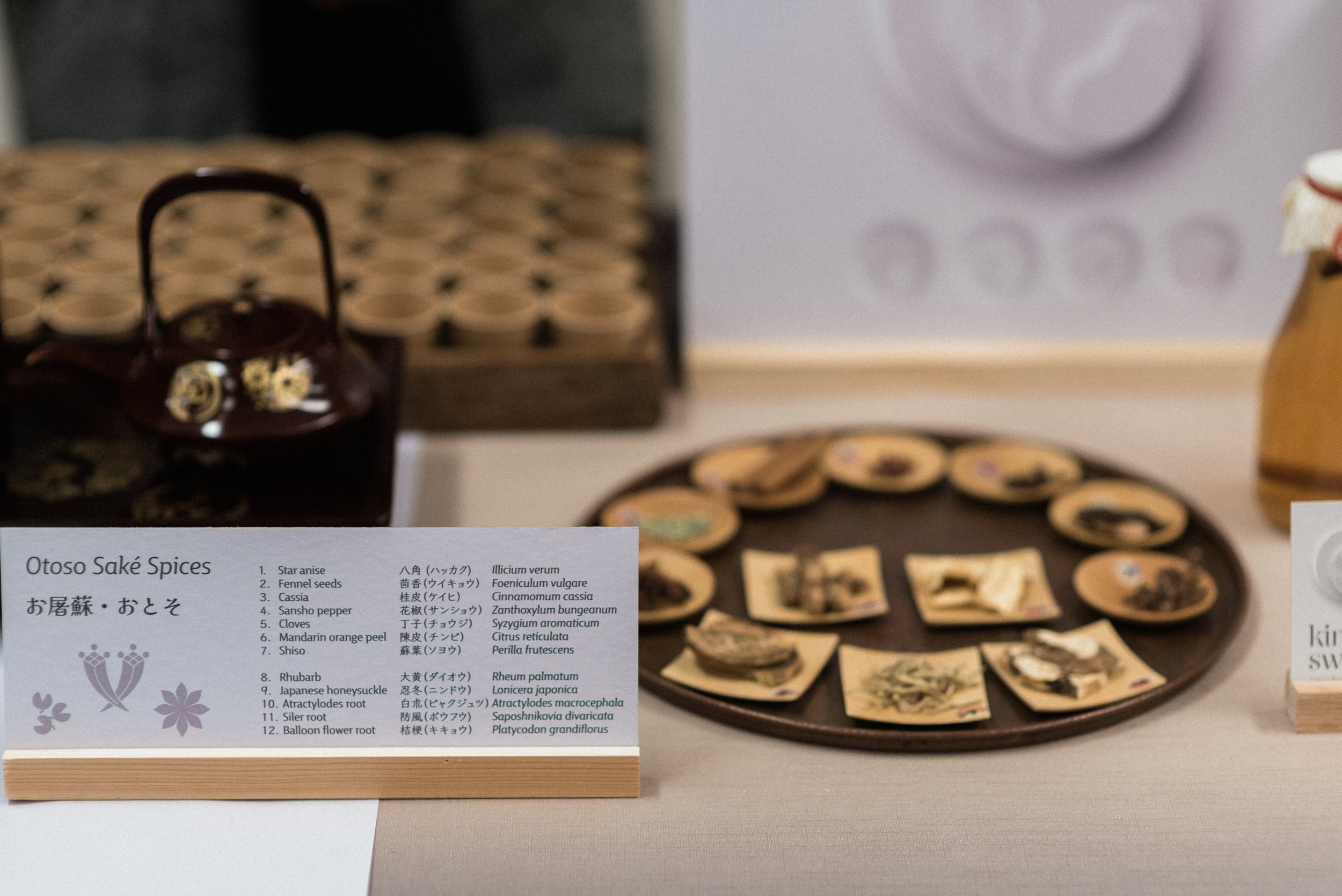
With only weeks to prepare for the exhibit but finally with a clear direction to guide me I created business cards, banners, informational display signage, and even a 2-foot felt Kagami-mochi on a handmade sanpo tray. I made six main display pieces, introducing visitors to wagashi and sweet traditions like Amazaké, Kagami-mochi, Hishi hanbira mochi, and more. I even managed to sew up tablecloths to match the Geppaku grey at 3 a.m. the day before the event.
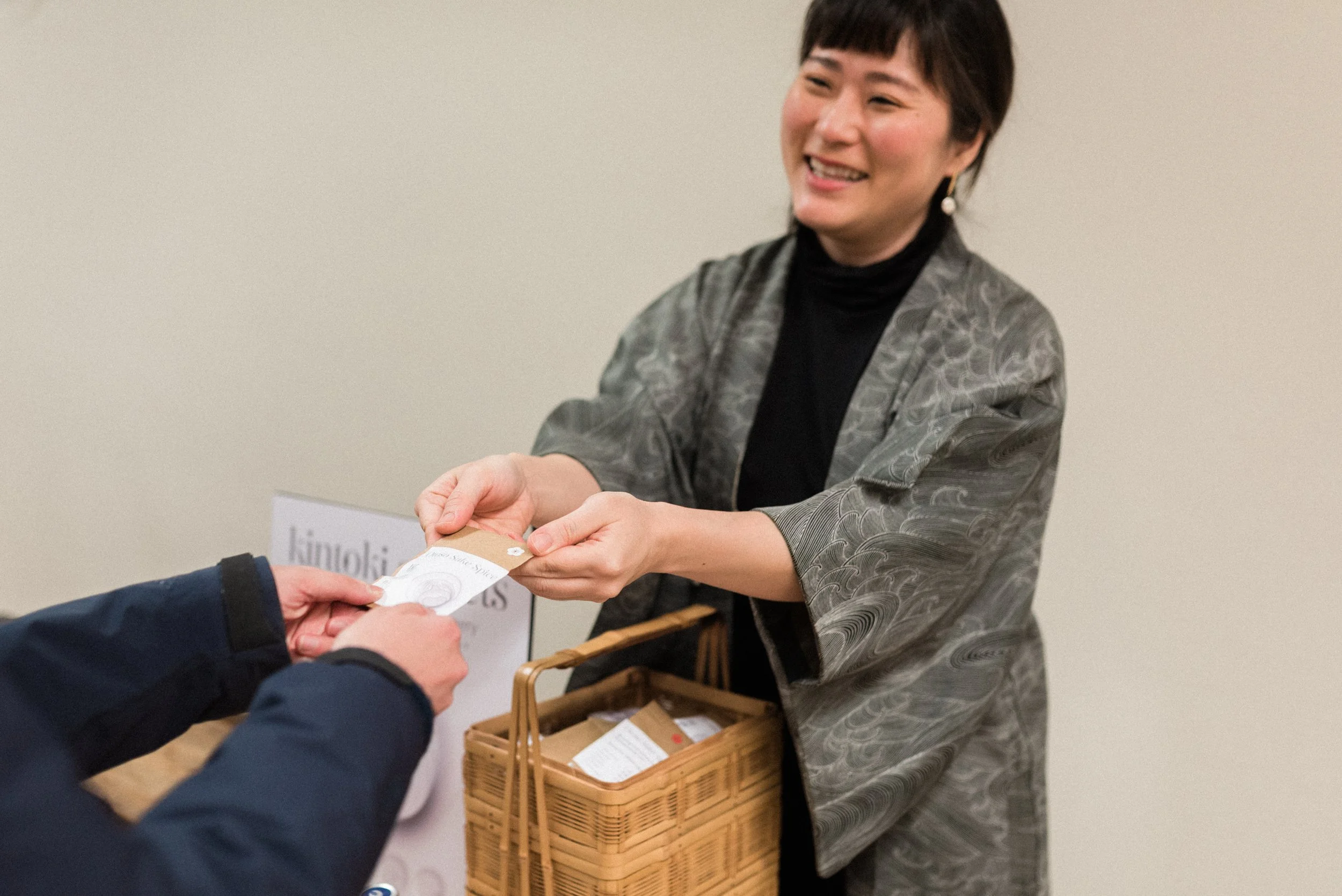
The exhibition was a success. Visitors experienced live amazake demonstrations, tastings, and a rich display of traditional sweets, with beautifully designed informative signage, visually intriguing display pieces with narrative and cultural tidbits that even some Japanese attendees hadn’t known. The experience reinforced my love for teaching wagashi and deepened my commitment to sharing culture through confectionery.
Finally!
Designing my own branding was, in many ways, a reflection of the work I do with wagashi: thoughtful, layered, and deeply connected to culture. It only took seven years to finally sit down and decide on something I would be satisfied with. Every decision, from typography to logo to colour became an exercise in observation, curiosity, and storytelling. In the end, the process reminded me why I love this craft: it is not only about sweets, but about the delicate, meaningful ways that culture can be preserved, shared, and celebrated.
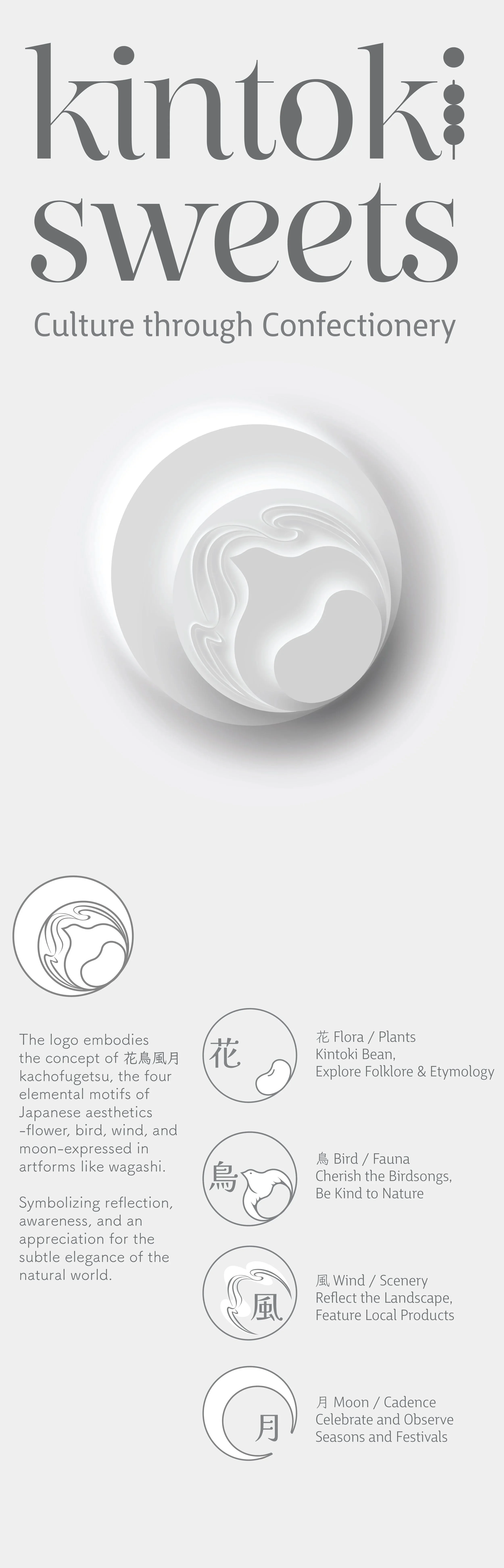
My logo and symbolism breakdown
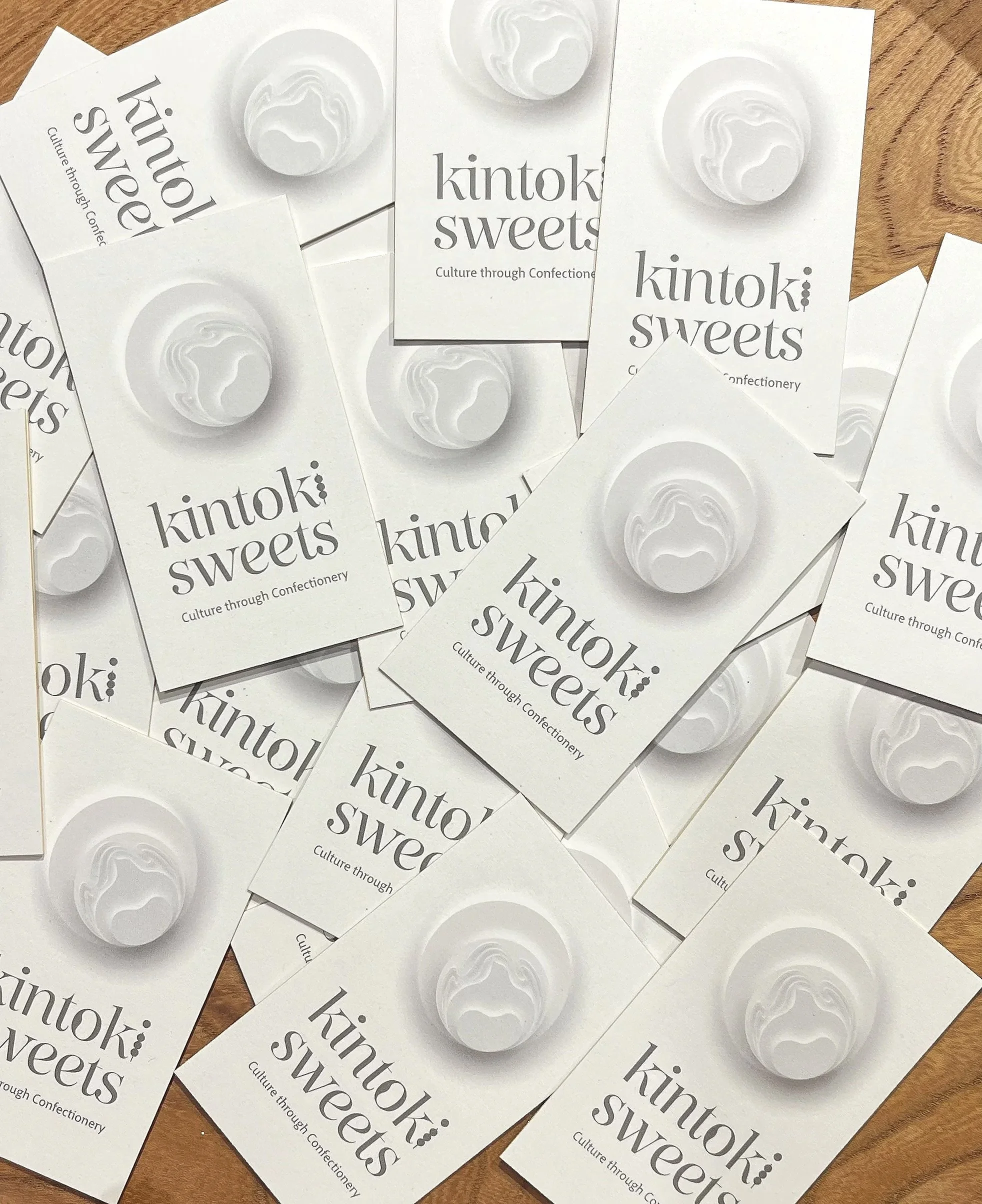
My business cards arriving a day before the event, a subtle sliver of edge painted gold adds some quiet class.
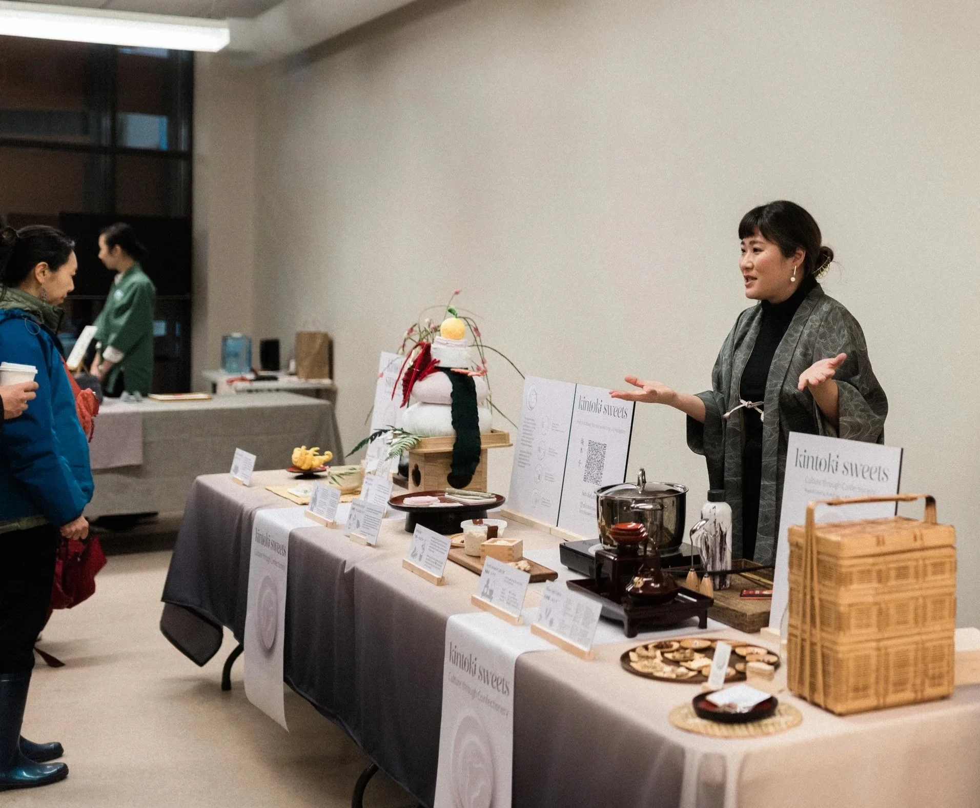
My exhibits booth looking polished and ready for guests.
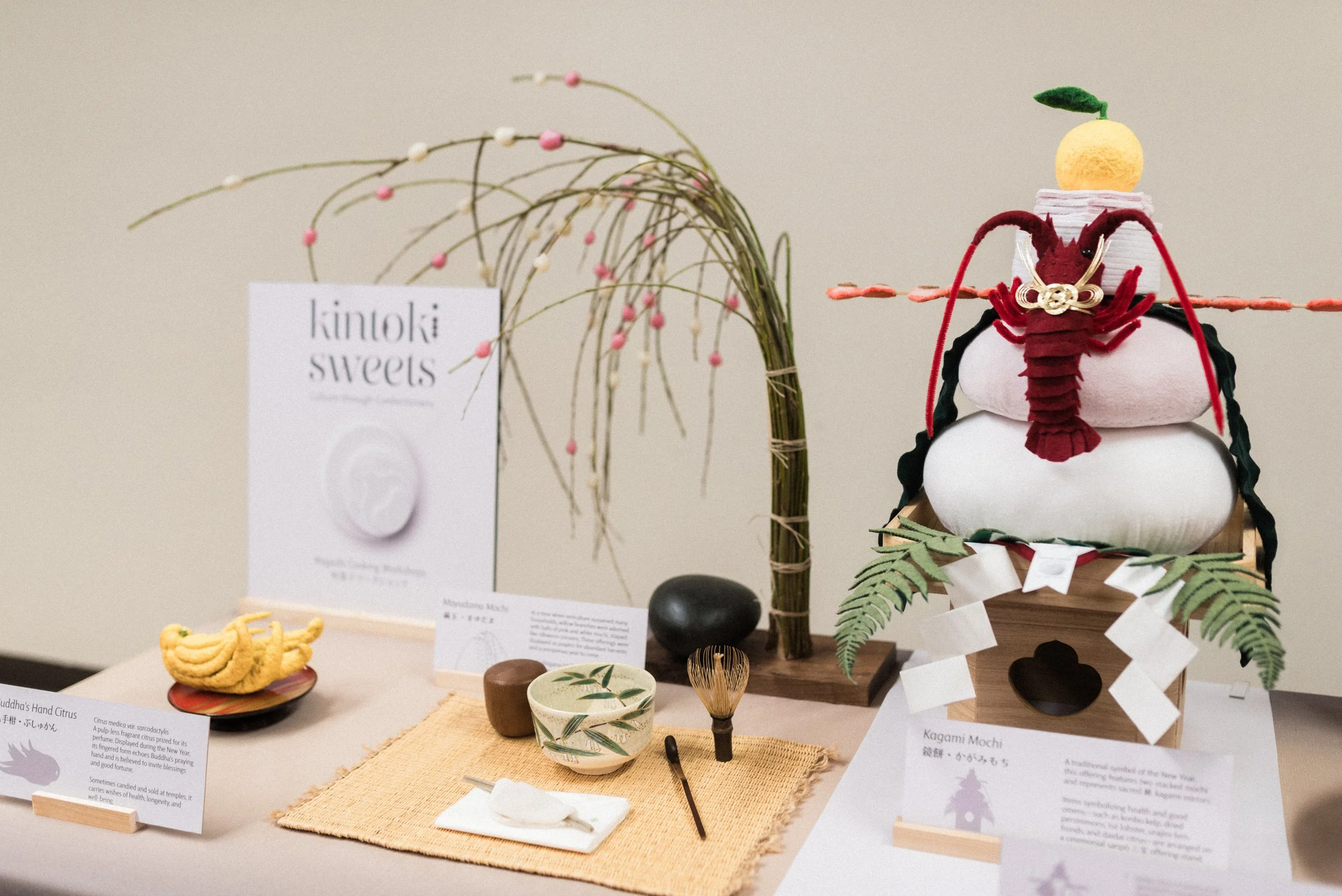
The stuffed kagami mochi stack was a guest favourite.